guide3.html�����������������������������������������������������������������������������������������100644 � 1333 � 1 � 10332 7100413717 12306� 0����������������������������������������������������������������������������������������������������ustar �tcdatmos������������������������other������������������������������������������������������������������������������������������������������������������������������������������������������������������������������������������������������������������
SSA Toolkit User's Guide: Contents
THE SINGULAR-SPECTRUM ANALYSIS TOOLKIT
USER'S GUIDE
Revision 3.1 (April 1997)
Distributed by
SSA-MTM Group, Department of Atmospheric Sciences, University of
California, Los Angeles
TABLE OF CONTENTS
1. INTRODUCTION
2. THEORY
3. TOOLKIT DEMONSTRATION
4. TOOLKIT SPECIFICATIONS AND
TECHNICAL ACKNOWLEDGMENTS
5. SUMMARY
6. ADDITIONAL ACKNOWLEDGMENTS
7. REFERENCES
NOTE: The entire guide is available
in HTML form (~300K including figures).
Manual Reference Pages for Version 3.1
(ssa,
carlo,
mtm,
spectrum)
Disclaimer
The developers of the SSA Toolkit are researchers attempting to make
some useful time-series analysis methods more accessible to the scientific
community. Although we use the tools ourselves and have made every effort
to ensure their accuracy, we can not make any guarantees. We provide the
Toolkit to you for free, but it is copyrighted. In return, you--the user--assume full responsibility
for use of the software. The SSA Toolkit and this Guide come without any
warranties (implied or expressed) and are not guaranteed to work for you
or on your computer. Specifically, the University of California, Los Angeles,
Department of Atmospheric Sciences; U.S. Geological Survey; Commissariat
à l'Énergie Atomique; and the various individuals involved
in development and maintenance of the SSA Toolkit are not responsible for
any damage that may result from correct or incorrect use of this software.
This Guide may be reproduced and distributed freely, provided that
this page is preserved on all copies and remains unaltered.
Reference to the Toolkit
If you feel that your research has benefitted from the use of the SSA
Toolkit, you can repay us by citing our Eos article:
- Dettinger, M.D., Ghil, M., Strong, C.M., Weibel, W., and Yiou, P.,
1995: Software expedites singular-spectrum analysis of noisy time series,
Eos, Trans. American Geophysical Union, v. 76(2), p. 12, 14, 21.
We also appreciate your references to the original articles that motivated
and made the Toolkit possible (see the reference list), and especially
to
- Vautard, R., Yiou, P., and Ghil, M., 1992: Singular-spectrum analysis:
A toolkit for short, noisy chaotic signals, Physica D, 58, 95-126.
Copyright © SSA-MTM group, (mostly) UCLA.
URL: http://www.atmos.ucla.edu/tcd/ssa/guide/guide3.html
This file last modified: March 11, 1998
������������������������������������������������������������������������������������������������������������������������������������������������������������������������������������������������������������������������������������������������������������������������������������������������������users.guide.demo1.html������������������������������������������������������������������������������100644 � 1333 � 1 � 60152 7072473745 14413� 0����������������������������������������������������������������������������������������������������ustar �tcdatmos������������������������other������������������������������������������������������������������������������������������������������������������������������������������������������������������������������������������������������������������
SSA Toolkit User's Guide: Demonstration, 1
THE SINGULAR-SPECTRUM-ANALYSIS TOOLKIT USER'S GUIDE
2. TOOLKIT DEMONSTRATION
This section presents a demonstration of the major functions of the
Toolkit. To follow along--once the SSA Toolkit has been installed (and
added to your search PATH if necessary)--attach to the directory `demo'
and proceed as described.
a. Basic Mouse Operations
The Toolkit interface is based on a series of images of buttons and
slides that will appear in small windows on your X-windows workstation.
The Toolkit is operated by clicking and dragging various of these items.
Only infrequently will you have to type in various names or numbers. These
basic operations are accomplished through movements with your workstation's
mouse and by typing on your keyboard, and are described below for those
unfamiliar with the use of X-windows interfaces.
When you are asked to click on something, move the cursor to the object
by moving your mouse, and then press down and release the left-most button
on your mouse. To double-click, simply click twice in rapid succession.
When you are asked to drag something, move the cursor to the object
by moving your mouse, then hold down the left-most button on the mouse
while moving the mouse (and cursor and, presumably, the object) to where
you want the object to be. Then release the mouse button.
When you need to type some name or number into a Toolkit window, move
the cursor to the space where you want to make an entry (by moving your
mouse). Then click within that space, type what you need, and proceed to
the next step.
Finally, in the following, the notation `Hit <enter>' means press
the button marked `Enter' or `Return' on your computer's keyboard.
Special Note---HANDLING ERRORS: Typically, when you enter
a name wrong, or otherwise make a mistake in the Toolkit, the Toolkit will
signal you in a special message that something is wrong or else may simply
wait for you to try again. Occasionally, if you really manage to baffle
the code, a tiny window may open with no room for a name or image, but
still the Toolkit will wait patiently for you to try again. The window
looks like the following on my workstation.

You may also get a blank spectrum or time series plot. Your best
bet is to press on the `-' button on the extreme lefthand side of this
tiny window (or the time series plot), drag down to `Quit', and thereby
kill the little window or blank plot. Then try what you were doing again,
correcting your mistake if possible. Less frequently, you may make a mistake
that kills the Toolkit. In such cases, restart the Toolkit by typing `spectra'
and try again.
b. Getting Started
Type `spectra' and hit <return> to launch the program `spectra',
and the following dialog box will open.
 Figure 1.--Initial
`spectra' window.
Figure 1.--Initial
`spectra' window.
This menu offers push-button access to the basic functions of the toolkit:
- FFT Spectrum estimation,
- Multi-Taper Method spectrum estimation,
- Maximum-Entropy spectrum estimation, and
- Singular-Spectrum Analysis.
We will work through examples using each in the sections that follow.
c. Quitting
Notice that anytime you want to stop using the SSA Toolkit, you simply
have to click on the `QUIT' button in the window above. The program will
shut all of the associated windows and close all associated files.
d. Selecting a Time Series
Before applying any of the Toolkit tools, we must first read in a file
containing the time series to be analyzed. (If you instead clicked on one
of the Toolkit buttons before selecting a time series to analyze, then
some error messages would appear in the window from which you started `spectra',
but otherwise the Toolkit would simply wait for you to try again.) Two
options for selecting the input file are:
- If you know the name of the input file, then click in the open
menu slot below `Input file', type the file name followed by <return>,
and then proceed with one of the Tools.
- If you can't recall the file name, double click on the open
menu slot immediately below `Input file', and the following window opens:

Figure 2. `Select a File' window.
This new menu provides several Motif-like functions for browsing among
your files, and then selecting the file that contains the time series you
want to analyze. The functions and displays on the lefthand side of the
window are:
- The `Current Directory' button--This button has the current
pathname on it. If you click on the button, a menu listing the tree above
your current directory appears. To move up a directory or more, drag the
cursor down the list to the directory you want.
- The file list (unlabeled)--This is the box immediately below
the Current Directory button. The names of 10 of the files at (or directories
below) your current location appear in this box. Along its right side is
a slide bar that can be dragged up or down to show other parts of the list.
Directory names in this list are followed by `/'.
Once you see the name of the file you want in this list, you can select
it by double clicking on its name in this list.
- The `Show hidden files' button--This button can be clicked to
either include (or exclude) files with names that begin with a period from
the file list.When this toggle button is in (dark), these file names are
included. When it is out (light), the file names are excluded.
- The `Filename' slot--This slot serves the same purpose as the
`Input File' slot on the first menu. Once you know the name of the file
you want to analyze, just click on this slot, type in the filename and
hit <enter>. Alternatively, you can type in its name and then click
on the `OK' button on the righthand side of the window.
- The `Select all files, files matching' buttons--If the `all
files' button is dark, then all files at this location are listed above.
If you want to narrow the search, type a string including the wildcard
character `*' into the slot next to `files matching' and click the `files
matching' button. The file list above will then show only those filenames
that match the wildcarded string along with any directories below the current
position.
The righthand side of the window has:
- The `OK' button--click on this once the correct filename has
been entered into the `Filename' slot on the lefthand side.
- The `Cancel' button--Click on this to abort this window and
return to the main menu.
- The `Update' button--Click on this button to force the system
to re-evaluate the file list on the lefthand side.
- The `Home' button--Click this button to relocate to your login
directory.
- The `Jump To' button--Click this button and a small window will
open to prompt you for the name of another directory. Enter a directory
name and press the `OK' button in the small window, and you will be repositioned
to the desired directory.
The Toolkit currently expects the input series to be in the form of:
- x(t) in ASCII (flat-file format), one element per line; or
- t, x(t) pairs in ASCII, one pair per line.
For this tour, let's start with the noisy time series called `soi' that
is stored in a file of the same name in the "examples' directory as
an ASCII list of 512 x(t) values, one per line. To choose the time series
`soi' for analysis, either:
- scroll down to the name of the input time-series file and double click
on it, or else
- type the input file name `examples/soi' below `Filename' and press
the `OK' button.
The `Select a file' window closes (if there has been no problem), and
the Toolkit window looks like:
 Figure 3. Spectra
window, after an input file is selected.
Figure 3. Spectra
window, after an input file is selected.
with the name of the input series appearing in the slot below `Input
file'.
Special Note---SIMULTANEOUS TOOLKIT APPLICATIONS: The user
may be tempted to apply the Toolkit to several time series simultaneously.
However, the Toolkit only can be applied to series sequentially. That is,
at any given time, Toolkit procedures always are applied only to the time
series named in the `Input File' slot. Furthermore, launching more than
one `spectra' window at a time will yield unpredictable results.
After a moment, a time-series plot of the data will appear in a graphics
window. The series is plotted with series values on the y axis and time
on the x axis. Time is plotted from 1 to N, where N is the number of data
points in the series.

Figure 4. Input series plot (soi), when IDL graphics package is specified.X-axis
units are months, and y-axis is dimensionless SOI units.
The time series `soi' that we have read in is noisy, with no deterministic
periodicities apparent amidst the background signal. In fact, `soi' is
a list of monthly values of the Southern Oscillation Index (SOI), a climatic
index connected with the seasonally recurring, oceanic El Niño condition
(Bjerknes, 1969; Rasmusson et al., 1990; Keppenne and Ghil, 1992). The
series `soi' was derived from monthly mean sea-level pressures at Tahiti
and Darwin, Australia, by removing their annual cycles, dividing the resulting
anomalies by the corresponding standard deviations, and then taking the
Darwin-minus-Tahiti difference (cf. Keppenne and Ghil, 1992). The SOI series
considered here is for the time interval from January 1942 through December
1990, during which no observations are missing.
Special Note---CHOICE OF GRAPHICS PACKAGES: The time-series
plot above was generated by the Toolkit's "hook" to IDL, a proprietary
plotting program. The Toolkit can produce these displays using any of several
graphics packages depending on which one you have loaded on your system.
Currently the choices are:
- IDL (proprietary),
- ACE/gr, a public domain package (also called xgraph, xmgr or xvgr),
- gnuplot, another public domain package, or
- no graphics hook, if you have access to none of the above.
To tell the Toolkit which package to use, create a file called `.spectra'
in your home directory (or the directory where you activated the Toolkit)
containing one of the following commands:
set viz IDL
set viz XGRAPH
set viz GNUPLOT or
set viz NULL.
Restart `spectra' if necessary by clicking on the `Quit' button,
editing the .spectra file, and then typing in `spectra <enter>' again.
Special Note---PRINTING TOOLKIT SPECTRA AND TIME SERIES: The
procedures for printing out a copy of any of the spectra generated by the
Toolkit depend on which of the graphics packages is used. In order to print
a graph from the particular graphics package you are using, you will have
to familiarize yourself with that package. For example, a file called `README.xgraph.users'
is provided in the `doc' directory to get xgraph users started.
Once the time series is displayed, you are ready to apply the various
tools to it, in whatever order you choose.
Progress messages (including some error messages), MTM results, and
the results of various SSA tests for oscillations and trends are viewed
by clicking the "Show Log" button at middle right of the
Toolkit menu. An editor window opens with all the various messages that
the Toolkit generates. While this editor window is open, the rest of the
Toolkit is frozen and will not function. If the editor is emacs, you can
close the window by typing ctrl-X ctrl-C somewhere in it.
Special Note---CHOICE OF EDITORS: The editor that is used
to display the log can be specified by adding another command to the `.spectra'
file in your home directory (or where you activated the Toolkit from).
To specify that the log be shown in the emacs editor, include the command
to specify that `xedit' be used
and to specify that the vi editor be used
in the .spectra file. The first two options above show how any separately
window-ed editor can be used. Editors that use the current window must
be accessed according to the third option.
e. FFT Spectrum
If you clicked the `FFT Spectrum' button first, a new menu window
opens and look like this:
 Figure 5.
Fourier Transform menu.
Figure 5.
Fourier Transform menu.
The `Fourier Transform' extension to the original menu controls the
application of Blackman and Tukey's (1958) window-correlogram procedure
for estimating time-series power spectra. There are two slide controls
below the `Fourier Transform' title.
- Dragging the `Resolution' slide resets the resolution (number
of frequencies) to be included in the resulting power spectrum. Actually
the number of frequencies is forced to be equal to a power of 2 that is
nearest the number shown on the slide. Then power densities at this number
of evenly-spaced frequencies between 0 and the Nyquist frequency, 1/2D,
are estimated.
Alternatively, you can type a resolution into the slot on the far right
of the slide to specify an exact number. The Toolkit does not expect you
to hit <enter>; instead as you change the number shown, the slide
will move automatically to reflect your entry.
- Dragging the `Window Size' slide resets the width of the window
function used to condition the analysis. As noted earlier, the smaller
the window size, the more independent samples are obtained for estimation
purposes and therefore the smaller will be the estimation variance. However,
the smaller the window size, the lower the actual spectral resolution of
the estimate will be. The user is cautioned to take full advantage of the
ease with which various choices of window size can be applied in the Toolkit.
Robustness of results is the simplest test of their validity. As above,
you can also type the desired Window Size into the slot on the far right.
Below the slides are a series of `Window type' buttons which
are clicked to choose the shape of the windowing function to be applied
in estimating the correlogram. These buttons are activated by clicking
on one. At any time, only one can be chosen. The window shapes available
are:
- Bartlett--triangular,
- Hamming--cosinusoidal,
- Hanning--also cosinusoidal, AND
- None--a tophat function.
As Press et al. (1989) have noted, the choice of window functions is
usually not as important as the choice of window size.
Once you have set these two controls, clicking the `OK' button
will launch the correlogram analysis. Very soon, a graphics window will
open, looking something like this (if you have set the resolution to 512
and window size to 77):
 Figure 6.
Correlogram plot for `soi'. X-axis units are cycles per month; y axis is
power density.
Figure 6.
Correlogram plot for `soi'. X-axis units are cycles per month; y axis is
power density.
The plot shown here looks different from the previous time-series plot
because (1) it is instead a power spectrum, plotted with the log of power
spectral density on the y axis and frequency on the x-axis; and (2) more
basically, this one is plotted with xgraph instead of IDL. To learn about
the options available within this graphics window, find and read the file
called `README.xgraph.users' in the `doc' directory.
Special Note---AUTOLAUNCHING: If the Toolkit did not wait
for you to press the `OK' button before performing the calculation, and
if you want it to wait, then make sure that the autolaunch is set properly
in the .spectra file mentioned above (in the context of choosing editors
and graphics packages). The command
in .spectra will tell the Toolkit to perform an initial FT analysis
with the default values immediately upon opening the `Fourier Transform'
part of the Toolkit menu. To turn this option off, just make sure the list
in brackets after set AUTOLAUNCH does NOT contain the word `fft'. To autolaunch
the other applications, include the words mem, mtm, and ssa in the list.
The frequencies in the power-spectrum plot generated by the Fourier
Transform program (as well as MTM and MEM) are expressed in terms of fractions
of 1/D. The range plotted is from 0 cycles to 1/2 cycle per sample period.
The latter is the Nyquist frequency, 1/2D, and is the theoretical upper
bound on frequency information in a discrete time series (see Press et
al., 1989, section 12.1).
The power spectrum displayed in the graphics window above shows peak
power between frequencies of zero and about 0.05 cycles per month. There
is an indication that this plateau may contain two peaks, one at about
0.019/month and the other at 0.037/month. These correspond to periodicities
of about 52 months and 27 months respectively. To the extent that we believe
that these are two non-spurious spectral peaks, we may tentatively guess
that they correspond to the quasi-quadrennial (QQ) and quasi-biennial (QB)
components of El Niño (Rasmusson et al., 1990), respectively.
These peak frequencies can be pinpointed by saving and looking at the
spectrum values (below) or, when using some graphics packages, by various
operations within the graphics window. For example, in the xgraph plot
above, x-y coordinates listed at lower right indicate the cursor location
in the plot units (x=frequency, y=power). Thus, by putting the cursor on
a peak, its frequency and power can be read directly from the screen.
Until the correlogram analysis has been performed at least once, the
label on the `Save' button on the right is faint whereas the label
on the `Save As' button is bold. Clicking the `Save As' button will activate
a file-selection window that is essentially the same as the one used to
open `soi' in the first place. Decide on a file name to which you want
the correlogram spectrum values saved. Subsequently (after you have selected
a name at least once), clicking the `Save' button will save the spectrum
to the most recently chosen file name. Clicking `Save As' will give you
the option of choosing another file name. In either case, the Toolkit saves
an ASCII list of frequencies, power densities, and error bars to the selected
file. Clicking the `Help' button in the far lower-right corner of
the Toolkit menu opens a small window that tells what the various FT buttons
do.
To help show some of the strengths of the various tools, let us also
quickly analyze another time series. Type the file name `ssa_mstr' into
the `Input File' slot at the top of the main Toolkit menu, and a plot will
appear of an artificial time series consisting of two oscillations with
nearly equal frequencies plus some white noise. The two oscillations "beat"
against each other with a result that alternates between large and small
amplitudes as the two move in and out of phase between cancellation and
reinforcement.
Once the new series is read and its time-series plot appears, you can
immediately perform a correlogram analysis by clicking on the `OK' button
in the `Fourier Transform' part of the menu. The result looks like the
following (when a resolution of 512 and window size of 77 is selected)
(figure 7).

Figure 7. Correlogram for `ssa_mstr'.X-axis units are cycles per sample,
and y-axis is power density.
Notice that the correlogram distinguishes only one peak in this signal.
We will want to compare this response to the results from MTM and MEM analyses.
If you pressed the `Maximum Entropy" button first,
a new menu window opens and look like this:
 Figure 8. Maximum Entropy Method menu.
There are two slide controls below the `Maximum Entropy Method'
title, and the file name for the data you are analyzing.
- Dragging the `Resolution' slide, resets the
resolution (number of frequencies) to be included in the resulting
power spectrum.
Alternatively, you can type a resolution into the slot on the far
right of the slide to specify an exact number. As you type in the
number, the slide will move to take that value automatically so that
you need not hit <enter> after typing in a resolution.
Once you have set these two controls, clicking the `OK'
button will launch the MEM spectrum analysis. Immediately
below the `MEM Order' slide, the word `Working...' will appear while
the MEM calculations are made. In the window into which you originally
typed `spectra' (to launch the Toolkit), various short messages
reporting the status of the program will appear. For the most part
(unless something goes wrong), these messages are of no concern. If
something goes wrong, they will help to determine where in the program
the problem occurred. Eventually, the message `Working...' in the
Toolkit window will be replaced by the word `Done'. Soon afterward, a
graphics window will open, looking something like this (if you didn't
change the default resolution or MEM order):
 Figure 9. MEM spectrum for `soi'. X-axis units are cycles per
month, and y-axis is power density.
Figure 9. MEM spectrum for `soi'. X-axis units are cycles per
month, and y-axis is power density.
The MEM spectrum for the SOI appears to corroborate the correlogram
analysis earlier by including strong peaks with periods around 52 (QQ)
and 26 (QB) months, which are accompanied by a large number of smaller
peaks at higher frequencies. Many of these other peaks may be
spurious.
Applying MEM to the artificial series `ssa_mstr' yields the
following spectrum (figure 10).
 Figure 10. MEM spectrum for `ssa_mstr'. X-axis units are cycles
per sample, and y axis is power density.
Figure 10. MEM spectrum for `ssa_mstr'. X-axis units are cycles
per sample, and y axis is power density.
Notice that MEM analysis
IS able to distinguish the two distinct harmonics that were built into
the series. The peaks appear at frequencies 0.225 and 0.220
cycles/time step, respectively. This greater resolution of harmonics
is surely the most attractive feature of MEM.
The `Save', `Save As', and `Help' buttons on the
right side of the MEM part of the Toolkit menu function in the same
way as the corresponding buttons in the Fourier Transform section.
Next Section |
Table of Contents |
References
URL: users.guide.demo1.html
This file last modified: May 12, 1997
����������������������������������������������������������������������������������������������������������������������������������������������������������������������������������������������������������������������������������������������������������������������������������������������������������������������������������������������������������������������������������������������������������������������users.guide.demo2.html������������������������������������������������������������������������������100644 � 1333 � 1 � 71046 7072473745 14420� 0����������������������������������������������������������������������������������������������������ustar �tcdatmos������������������������other������������������������������������������������������������������������������������������������������������������������������������������������������������������������������������������������������������������
SSA Toolkit User's Guide: Demonstration, 2
THE SINGULAR-SPECTRUM-ANALYSIS TOOLKIT USER'S GUIDE
h. Singular-Spectrum Analysis
Clicking the `Singular Spectrum Analysis' button causes this
control panel to open up:
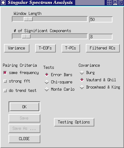
Figure 14. Singular-spectrum analysis control panel.
There are two slide controls below the `Singular Spectrum Analysis'
title.
- Dragging the `Window Length' slide resets the maximum lag considered
in the SSA. Window length determines (i) what gets identified and lumped
as low-frequency variability by the SSA and what may appear as distinct
oscillatory pairs, (ii) the statistical confidence of the SSA analysis,
and (iii) in a less certain sense, how many significant components SSA
is able to distinguish.
Let us expand briefly on each of these points: (i) Commonly, SSA will
use one or two low-frequency components to capture all variability that
has periods greater than the window length. If there is an oscillation
with a 60 month period present in a series, SSA will not be able to isolate
it from other long-term fluctuations unless the window length is longer
than 60 months. (ii) The number of statistically independent samples available
for estimating the autocorrelation structure of a series depend (for greatest
lags) on the size of the window. For example, at best (when a series has
essentially no memory), only 20 samples could be used to estimate a lag-50
correlation in a time series that is 70 observations long. If the series
includes memory, the number of independent samples drops quickly. Therefore
Vautard et al. (1992) recommend that the window length never rise above
about N/5. (iii) As a rule of thumb, SSA (and most PCA's) only seem to
be able to identify on the order of M/10 significant components before
oscillations start to be lumped together. Thus ideally, the window length
will be somewhat greater than the longer periodicities under investigation,
but also no more than about N/5 and no less than about M/10 times the number
of significant components that might be present. Juggling these contraints
is difficult with most real world datasets, and usually SSA results have
to be judged in terms of their robustness to changes in window length.
The user is therefore urged to experiment with the `Window Length' controls
extensively in any Toolkit application of SSA.
As a practical matter, the choice of window length sets the dimension
of the lag autocorrelation matrix to be constructed and diagonalized by
SSA, and thus determines the computational burden of the application. Typically
the burden is small when window length is below about 200. A slower analysis
results, but is entirely feasible on most machines, with window lengths
up to 1,000.
As with the other slide bars in the Toolkit, window lengths can be typed
directly into the slot on the right end of the bar. The Toolkit does not
expect you to conclude your entry with <enter>. Instead, as you type
in the window length, the slide will move automatically to reflect your
changes.
- Dragging the `# of Significant Components' slide resets the
number (S) of SSA components that get saved for future analyses.
Once you have set these two controls, clicking the `OK' button
will launch an SSA. Anticipating our results for the `soi' series, set
the window length to 60 months and the number of significant components
to 4. This window length permits us to capture the QQ El Niño oscillations
while still providing a high degree of statistical significance (Keppenne
and Ghil, 1992).
Make sure the "Error Bars" button under the Tests rubric is
depressed (default), then click the `OK' button. The message `Working ...'
appears below the slide bars, and a few moments later is replaced by `Done'.
Soon thereafter a graphics window will open to display the log-eigenvalue
spectrum from the specified SSA.
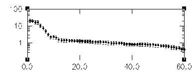
Figure 15. SSA eigenvalue spectrum for `soi'. X-axis units are SSA component
number, and y axis is variance contributed.
The eigenvalues in this spectrum are equal to the time-series variance
explained by each SSA component. Since the window length was set to 60,
SSA decomposes the time series into 60 components and thus 60 eigenvalues
are plotted. As in many PCA's, significance of the various components can
be judged qualitatively by noting which components contribute significantly
more variance than would be expected from the noise background. The noise
background in turn is assumed to include the components that plot in the
flat-lying parts of the eigenvalue spectra, in line with the highest-order,
least-contributing components. The SOI spectrum is flat-lying in the range
of components from about 10 to 60. This subset probably represents the
noise components. Almost certainly, they would be indistinguishable from
noise by most statistical tests (see Significance tests, below).
There are 4 buttons immediately below the SSA slide bars. These buttons
only should be used after the SSA `OK' button has be clicked at least once
or if the program was autolaunched (that is, after SSA has been performed
on the series at least once). The buttons are:
- The `Variance' button --Clicking this button creates a plot
of normalized eigenvalues (as percents of total variance captured), rather
than the unnormalized eigenvalues shown in the initial plot from SSA.
- The `T-EOFs' button --Clicking this button creates a plot (or
series of plots, depending on which graphics package is used for the displays)
of the S significant temporal-EOFs generated by SSA.
- The `T-PCs' button --Clicking this button creates a plot (or
plots) of the S significant temporal-PCs generated by SSA. For example,
when this button is pushed (and the graphics package IDL is used), a set
of graphs like figure 16 is generated. These series are the amplitudes
of the projections of the original SOI series onto the corresponding T-EOF
filters, in lag space. They can be difficult to interpret and so very often
you will want to focus on the shape of the filters (the T-EOFs) and on
the reconstructed (filtered) versions of the time series--the RCs. If you
are using the IDL or gnuplot packages for your graphics, the T-PCs (and
T-EOFs) are arranged so that component 1 is in the upper left, component
2 is in upper right, component 3 is below component 1, and so on. If you
use xgraph for your plotting, the T-PCs (and T-EOFs) will be overlaid on
a single plot.
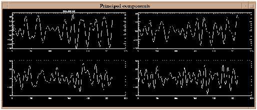
Figure 16. T-PCs plot for `soi' when 4 significant components are
considered (using IDL). X-axis units are `beginning months' of the lag
relations, and y axis is dimensionless SOI.
- The `Filtered RCs' button --Clicking this button allows you
to specify SSA components to reconstruct. A small window labelled `RClist'
opens with a slot for entering the component numbers that you want to reconstruct.
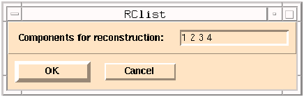 Figure 17.
Window for selecting SSA components to be reconstructed.
Figure 17.
Window for selecting SSA components to be reconstructed.
Edit the list by clicking on the numbers you want to change and retyping
or by clicking at the end of the list and then typing any additional component
numbers. When the list is ready, click on the `OK' button to perform the
reconstruction. Click the `Cancel' button to abort this action and get
back to the main SSA menu.
The leading 10 components in figure 15 plot above a distinct break in
the noisy part of the spectrum, and thus may contain signals that are more
structured than the noise. In particular, we are interested in the leading
four components which plot as two pairs of nearly equal eigenvalues: 1-2
and 3-4. As discussed earlier, pairs of nearly equal eigenvalues in SSA
must be suspected of, together, capturing oscillations in the series. However,
the eigenvalues plotted are subject to numerical and sampling errors (North
et al., 1982), and mere pairing of eigenvalues is not enough to guarantee
an oscillation has been isolated. In the eigenvalue plot above, the error
bars show the ad hoc range of estimation errors that might be expected
in this SSA. (See below for more sophisticated significance tests.) Any
of the eigenvalues with significantly overlapping error bars could represent
an "oscillatory pair'. Also eigenvalues with error bars that overlap
significantly with the error bars of the noise part of the spectrum must
also be suspected of being part of that noise.
Pairing Criteria
The Toolkit will identify potentially paired eigenvalues among the leading
S components using 3 pairing criteria which can be activated concurrently.
If additional criteria are selected, the `OK' button must be clicked again
with the 'Error Bars' test selected. The results of these tests are written
to the log file.
- `Same Frequency' button --Following Vautard et al. (1992, section
4.2), the eigenfunctions (EOFs) associated with the potential clusters
are subjected to a simple Fourier transform to identify the frequency that
they pass most readily (highest response function). Only those "pairs"
that respond most to frequencies within a fraction of the SSA bandwidth
of each other may together represent an oscillatory component.
- `Strong FFT' button --Also following Vautard et al. (1992),
the same Fourier transform is used to determine how much of a given signal
the potential oscillatory pair would capture together. If this overall
capture is not greater than 95 percent, then the pair is rejected as an
oscillatory component.
For the SOI example, the log file shows that components 1-2 and 3-4
meet both criteria for being oscillations. We will return to investigate
the oscillations after considering some more of the controls in the SSA
part of the menu.
The final button among the paring criteria is the `Do trend Test'
button in the lower lefthand part of the SSA part of the Menu. Clicking
on this button prior to restarting SSA (by clicking the `OK' button) activates
two tests that help to identify trending and low-frequency SSA components.
The tests performed when this button is activated are:
- Kendall's tau nonparametric trend tests on the temporal PC (T-PCs)
series developed by SSA as well as on reconstructions of the suspect components
(RCs), and
- Counts of the numbers of zero crossings within the temporal EOFs.
The results of these tests are also printed into the SSA log and can
be viewed by clicking the `Show Log' button in the main menu.
Significance tests
Choose one of the three test types, then click on the Testing Options
below to set the preferences for the particular test.
`Error Bars' button (default) Constructs a set of ad-hoc error
bars based on the estimated decorrelation time of the time series according
to:
dlk = (2kL/N)1/2 lk
where L is a typical decorrelation time for the time series and k is
a user supplied multiplier between 1 and 2. The Toolkit estimates L to
be the inverse of the logarithm of the lag-one autocorrelation of the time
series. Upon clicking the `Testing Options' button, a new window will open
similar to figure 18.
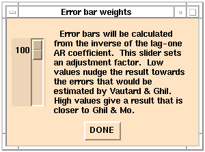 Figure 18
`Error bar weights' menu.
Figure 18
`Error bar weights' menu.
By dragging the slide up or down the user sets k to some value between
100 and 200 percent (1.0 and 2.0). As indicated, k values near 100 percent
are closer--but not generally equal to--the liberal error bars of Vautard
and Ghil (1989); k values near 200 are closer to the conservative error
bars of Ghil and Mo (1991a). Click the `Done' button when a k value
has been selected and the window will close so that analysis can proceed.
`Chi-squared' button: invokes a significance test against a
red noise null-hypothesis, as described by Allen and Smith (1996). It follows
the Monte Carlo SSA (MCSSA) approach (see below) in which red-noise surrogates
are projected onto the basis consisting of the SSA eigenvectors (EOFs)
of either the data or null-hypothesis covariance matrix. In contrast to
MCSSA, the chi-squared test approximates the distribution of surrogate
projections as chi-squared with 3M/N degrees of freedom. This is pretty
accurate for sinusoidal EOFs and a linear (AR-type) noise null-hypothesis
-- see Allen and Smith (1996), appendix. The probability of n excursions
above the mth percentile is then estimated using the binomial distribution.
This is, of course, far quicker than generating a large ensemble of surrogate
noise series using MCSSA. Results should always be checked using the Monte
Carlo approach, which is also essential with more complex noise models.
Clicking on Testing Options displays the Chi-squared preferences
panel:
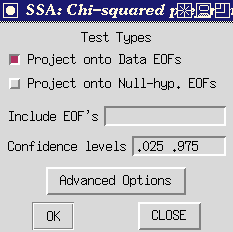 Figure 19
`Chi-Squared Preferences Panel.
Figure 19
`Chi-Squared Preferences Panel.
All buttons have same meaning as described on the Monte Carlo SSA Preferences
panel (see below), except that there are zero noise realizations by definition.
`Monte Carlo' button--Clicking this button invokes the Monte
Carlo SSA (MCSSA) significance tests described by Allen and Smith (1996),
which test significance against a red noise null-hypothesis. Clicking on
Testing Options displays the MCSSA preferences panel:
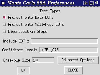 Figure 20
`MCSSA Preferences Panel.
Figure 20
`MCSSA Preferences Panel.
MCSSA Test Types:
In each case, a large ensemble of red-noise surrogate time series are
generated, each with the same length and same expected lag-1 autocorrelation
as the time series to be tested (but see note under 'Include EOFs' below).
The first two tests each use a fixed EOF basis, and can be computed individually
or simultaneously by checking the individual buttons; the resulting power
spectra are plotted against the dominant frequency of the EOFs in the basis.
Plotting against rank will be added in a future release. The "Eigenspectrum
Shape" test mutually excludes the other two, and the resulting eigenvalue
spectrum is plotted against eigenvalue rank.
- Project onto Data EOFs: The data, together with many AR(1) noise
realizations are projected onto the EOFs of the data covariance matrix.
- Project onto Null-Hypothesis EOFs: The data, together with many
AR(1) noise realizations are projected onto the EOFs of the expected covariance
matrix of pure noise, plus any selected "signal" EOFs of the
data covariance matrix which are specified as "included" in the
null-hypothesis, with the rest as for pure noise, after orthogonalizing.
See Allen and Smith (1996) section 4.4.
If no data EOFs are specified in the 'Include EOFs' slot, the null-hypothesis
is pure red noise. The noise covariance matrix is computed analytically
from the estimated lag-1 autocorrelation coefficient of the test time series.
If certain EOFs are specified in the 'Include EOFs' slot, the noise
parameters are estimated taking into account the presence of the "signal".
The resulting 'hybrid basis' is the most reliable if you have already identified
a strong signal in your data (e.g. an annual cycle), which would otherwise
overwhelm the noise parameter estimation.
- Eigenspectrum shape: Test based on eigenspectrum shape, in which
a new EOF basis is computed for each noise realization by diagonalizing
its individual covariance matrix-- see Elsner and Tsonis (1994) or Dettinger
et al. (1995). The ranked eigenvalue spectrum of the data is plotted along
with chosen percentiles of the ranked eigenvalue spectra of the noise realizations.
Include EOFs: List of "signal" EOFs (by rank) to include
in the noise null-hypothesis, from which the noise surrogates and null-hypothesis
EOFs are computed. Note that irrespective of basis (data or null-hyp. EOFs),
the characteristics of the noise, and thus the error bars are modified
by including data EOFs. In fact the contribution of the latter to the lag-1
autocorrelation of the data time series are removed, when they are included
in the null-hypothesis, see Allen and Smith (1996). If no data EOFs are
specified, the null-hypothesis is pure AR(1) noise. Set of space-delimited
integers. Not relevant to the 'Eigenspectrum shape' test.
Confidence levels: Pair of confidence levels of the noise null-hypothesis
to plot. For example, 0.05 and 0.95 would plot noise error bars spanning
the 5th to 95th percentiles of the noise distribution. Two space-delimited
reals.
Ensemble Size: Number of Monte Carlo noise realizations.
OK: Launches the test using the Window Length and Covariance
matrix-type given in the Singular Spectrum Analysis control panel (you
don't have to press "OK" on that panel to run the Monte Carlo
SSA test). Button remains depressed while tool is working. (NB: The Burg
covariance matrix estimation option is not supported by MCSSA which defaults
to Vautard-Ghil if Burg is selected on the main SSA panel.)
Advanced Options: Not supported in this release.
Example: A typical testing procedure would be as follows (i)
begin by testing against pure noise and identify frequencies at which the
data displays anomalously high power against this null-hypothesis; (ii)
find the data EOFs which correspond to these frequencies (being data-adaptive,
these will often provide a better filter for the signal than the corresponding
EOFs of the noise); finally (iii) re-test including these EOFs in the null-hypothesis
to check if there are other features in the spectrum which were concealed
by the dominant signal . It is, of course, consistent to iterate this procedure,
but beware of the problem of test multiplicity discussed in Allen and Smith
(1996) section 4.2: iteration makes the test increasingly liberal, so results
which are still on the margins of acceptable significance after a couple
of iterations including successively more EOFs into the "signal"
should be ignored.
Covariance Estimation
The method for estimating the autocovariance matrix that is decomposed
(diagonalized) by SSA is chosen by clicking on the `Burg' button
, the `Vautard et al.' button , or the ` Broomhead &King
' button in the lower right part of the menu. As indicated in the theoretical
section, Burg estimation is an iterative process based on fitting an AR
model with a number of AR components equal to the SSA window length. The
Burg approach in principal should involve less "power leakage"
due to the finite length of the time series and should therefore improve
resolution (Penland et al., 1991). However, Vautard et al. (1992) found
that the Burg estimate can induce significant biases when nonstationarities
and very low-frequency variations are present in the series. Thus in some
cases it will be worthwhile to try the Vautard et al. method. Also, for
long series (N on the order of 5,000), the Vautard et al. estimate is less
computationally burdensome and thus is completed more quickly. Finally,
in practice, we have found that the Vautard et al. method is more prone
than is the Burg method to numerical instabilities (yielding negative eigenvalues)
when pure oscillations are analyzed. Both the Burg and Vautard et al. methods
impose a Toeplitz structure upon the autocovariance matrix whereas the
Broomhead & King method does not. The Broomhead & King method is
thus somewhat less prone to problems with nonstationary time series (Allen
et al., 1992b), although the Vautard et al. method seems untroubled by
all but the most extreme nonstationarities. The Toeplitz methods also impose
symmetries on the EOF shapes whereas the Broomhead & King method does
not. However the Toeplitz methods do appear to yield more stable results
under the influence of minor perturbations of the time series (Allen and
Smith,1996).
To conclude our tour of the SSA menu, clicking the `Save' or
`Save As' button in the main SSA menu opens a window that prompts you
for which SSA results to save and where to save them. The results saved
are from the most recent invocation of SSA. The window looks like
 Figure
21. `Save SSA Results' window.
Figure
21. `Save SSA Results' window.
SSA results (components) that can be saved are:
- Centered series--a copy of the original series with the time mean subtracted.
- Eigenvalues--unnormalized.
- Percentage of Variance--eigenvalues, normalized to represent percentages
of total series variance.
- Empirical Orthogonal Functions--the leading T-EOFs, from T-EOF 1 to
the Number of significant components.
- Principal Components--the leading T-PCs, from T-EOF 1 to the Number
of significant components.
- Reconstructed Components--the most recently constructed RC series.
Click on the slot next to one of the SSA results (components) listed
on the left side of the window and type in the file name where you would
like to have that result saved. Make sure the corresponding button on the
far left is also clicked, and then click on the OK button to actually
perform the save. The Cancel button allows you to return to the
Toolkit menu without actually performing the save.
And finally, to return to our analysis of SOI, having run SSA once already
above, you might want to click on one or more of the buttons described
above and rerun the analysis. If you click the `Filtered RCs' button, and
reconstruct the first 4 components, then the resulting series will look
like the following:
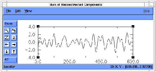
Figure 22. Reconstruction (RC) of components 1-4 of `soi'. X-axis units
are months, and y axis is dimensionless SOI units.
The series represents the sum of the results of filtering SOI by each
of the 4 leading T-EOFs from SSA. The oscillatory signals are nearly all
that remains. Notice, in the RC series above, the marked decrease in amplitude
of the summed QQ and QB components of the SOI series between about 200
and 350 months (that is, between about 1960 and 1972). Information about
these slow variations of oscillatory amplitudes typically is lost in many
spectrum analyses, but is available immediately using SSA.
If this SSA-filtered RC series is now analyzed by MEM, the frequency
spectrum of the RCs is much simpler than that of the complete time series,
since most "noise" has been removed (Penland et al. 1991, Keppenne
and Ghil 1992). Because the frequency spectrum of the series shown above
is simpler, a lower-order (M=20) MEM can be applied and fewer spurious
peaks result.
To do this, notice in the SSA log that the reconstructed series was
save to a file called `test_rc.out'. Type this file name into the `Input
file' slot at the top of the Toolkit menu and hit <enter>. Once the
file has been read, click the `Maximum Entropy' button (if the MEM menu
is not already open). Change the MEM Order to 10 and press th>e MEM
`OK' button. The resulting spectrum should look like figure 25.
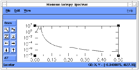
Figure 23. MEM spectrum of RC 1-4 of `soi'. X-axis units are cycles
per month, and y axis is power density.
The MEM spectrum of the RC series shows the same QQ and QB peaks as
in original SOI series, but with no spurious peaks and an increase in the
signal-to-noise ratio from 10 for the unfiltered to 1010 for the filtered
data.The individual peaks are also more clearly defined.
Recall that the initial MEM spectrum showed peak power at 26 months
and 52 months. However, at the MEM order necessary to resolve these peaks,
many spurious peaks also appeared. Using SSA, the oscillations were identified
instantly without having to search for some nominally optimal bandpass
filter. The contributions to the original series from the leading oscillatory
components were reconstructed and then passed again through the maximum-entropy
analysis. The next step in such an analysis might be to use the Toolkit
setting to quickly explore the sensitivity of results to various MEM orders
and SSA window lengths.
MTM analysis of the RCs of components 1-4 of 'soi' yields a spectrum
like figure 24. Notice that the noisy high-frequency parts of the MTM spectrum
have been much reduced.
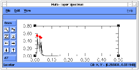
Figure 24. MTM spectrum of reconstruction of SSA components 1-4 of `soi'.
X-axis units are cycles per month, and y axis is power density.
To complete the other example, when SSA is applied to the contrived
series `ssa_mstr' with a window length of 40, the eigenspectrum looks like
figure 25.

Figure 25.--SSA eigenvalue spectrum for `ssa_mstr'. X-axis units are
SSA component number, and y axis is eigenvalue (or variance contributed).
SSA is clearly indicating that there are two sets of paired, non-noise
components in this series, as we expect. MEM analysis of the reconstruction
of those first 4 components yields the power spectrum in figure 26.The
signal-to-noise ratio has been increased by 104, and the two peaks are
even more clearly separated than before application of SSA.
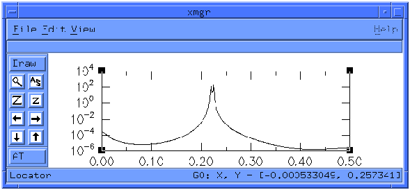
Figure 26.--MEM spectrum of RC of components 1-4 of `ssa_mstr'. X-axis
units are cycles per sample, and y axis is power density.
By now, if you have been following closely, you have seen essentially
every control that the Toolkit provides, except for those that are specific
to the particular graphics packages used. A close reading of some of the
pertinent literature is warranted at this time. Also, `README' files are
provided that outline some of the more crucial controls in the graphics
packages.
Special Note---TOOLKIT FUNCTIONS IN BATCH MODE: The Toolkit's
Graphical user interface is actually a front end for several FORTRAN programs
that perform the actual calculations. We refer to these programs as the
tools. The tools have been structured as Unix commands so that users can
run them independently from the interface. They are described by Unix manual
pages, now written in hypertext, and which have been included with the
Toolkit. The pages describe the operation of the tools called ssa, mcssa,
spectrum, carlo, and mtm (described briefly in the next section).
With some simple scripts, the user could do multiple production runs
of one or more of the Toolkit functions. An example of such a script follows.
This script (a) runs a user-provided program `series.read' to extract various
series numbered from 1 to 30 from a large dataset and put them, in turn,
into a file called `t', (b) uses the Toolkit `spectrum' tool to perform
an MEM analysis on each time series in turn, (c) adds the latest MEM spectrum--in
file `mem.out'--to the sum of the previous ones, and (d) then puts the
sum into a file called `spectrum.all'.
#!/bin/sh
i=1
while [ "$i" -le 30 ]
do
i=`expr $i + 1` series.read<<END
$i
END
echo Using Toolkit spectrum tool to MEM series $i
spectrum t -p 40 -f 252
paste mem.out spectrum.all >! t
awk '{print $1,$2+$4}' t >! spectrum.all
done
rm t mem.out
echo End of script
---------------------------
A FINAL CAUTION FROM THE AUTHORS:
The Toolkit provides a powerful set of tools and, like any powerful
tool, provides lots of opportunities for MISAPPLICATION. Please be careful
and wherever possible rely on common sense and the robustness of results
more than on the simplicitty of images on the screen. Also remember that
the line between noise and signal can be subjective and transitory.
References
Table of Contents
URL: users.guide.demo2.html
This file last modified: May 12, 1997
������������������������������������������������������������������������������������������������������������������������������������������������������������������������������������������������������������������������������������������������������������������������������������������������������������������������������������������������������������������������������������������������������������������������������������������������������������������������������������������users.guide.intro.html������������������������������������������������������������������������������100644 � 1333 � 1 � 10005 7072473745 14531� 0����������������������������������������������������������������������������������������������������ustar �tcdatmos������������������������other������������������������������������������������������������������������������������������������������������������������������������������������������������������������������������������������������������������
SSA Toolkit User's Guide: Introduction
THE SINGULAR SPECTRUM ANALYSIS - MULTITAPER METHOD TOOLKIT
USER'S
GUIDE
1. INTRODUCTION
The Singular-Spectrum Analysis (SSA) Toolkit is a program (actually
a set of programs) that performs detailed spectral analyses and decompositions
on an input time series. The toolkit contains procedures for:
(a) decomposing time series into trends, quasiperiodic and periodic
oscillations, other significant components, and noise,
(b) reconstructing the contributions of selected components of the time
series, and
(c) estimating spectral properties of the time series or any of its
components by modern spectral methods.
SSA is the method provided for separation of trends, periodic and other
significant components, and noise in the time series provided (tasks a-b
above), and three methods of spectral-analysis (task c) are provided: Blackman-Tukey
correlogram estimation, Multi-Taper Method (MTM), and Maximum-Entropy Method
(MEM). The basic philosophy of the Toolkit is that only the simultaneous
and flexible application of more than one spectral estimation method can
provide exhaustive and reliable information on a given time series. The
four methods tested and incorporated in the current version seem to complement
each other well, but do not exclude the use of additional methods in future
versions.
This document briefly describes some of the theory behind the singular-spectrum
decomposition and the spectral-analysis methods, and demonstrates how to
use the Toolkit. More details about the various procedures can be found
in:
MEM: Childers (1978), Press et al. (1989), and Penland et al. (1991).
Press et al. (1989, chapters 11 and 12) also provide excellent overviews
of spectral methods and eigensystems analysis, while Manly (1986) provides
a useful introduction to principal-components analysis. The description
of theoretical aspects of the various procedures that follows draws heavily
from these sources. However, the description is by no means an exhaustive
or even complete introduction; for that, the user must become familiar
with the original literature.
Section 2 describes some of the theory and theoretical considerations
behind the tools provided by the Toolkit. Section 3 demonstrates many of
the Toolkit functions. Sections 4 outlines the specifications of the Toolkit
and acknowledges the many software contributions that made it possible.
Finally, section 5 summarizes the current state of the Toolkit.
The Toolkit was developed at, and is distributed by, the University
of California, Los Angeles, with contributions from the U.S. Geological
Survey in San Diego, California, and the Commissariat à l'Énergie
Atomique in Gif-sur-Yvette, France.
References
Table of Contents
URL: users.guide.intro.html
This file last modified: January 18, 2000
���������������������������������������������������������������������������������������������������������������������������������������������������������������������������������������������������������������������������������������������������������������������������������������������������������������������������������������������������������������������������������������������������������������������������������������������������������������������������������������������������������������������������users.guide.mtm.html��������������������������������������������������������������������������������100644 � 1333 � 1 � 34774 7072473745 14216� 0����������������������������������������������������������������������������������������������������ustar �tcdatmos������������������������other������������������������������������������������������������������������������������������������������������������������������������������������������������������������������������������������������������������
If you pressed the `Multi-Taper Method' button,
new menu window should appear resembling Figure 1.
Figure 1. Control panel for Multi-Taper Method.
There are three (3) options that are changed by the user explicitly
entering chosen values of parameters:
- Selecting the `Frequency Range' button
will allow you to change the frequency range from its default
value f=0 to f=f_Nyquist=0.5/dt (the Nyquist freqency, where dt is the
sampling interval of the data read in and equal to dt=1 by default if no
sampling interval was provided). Either the lower `from'
frequency f1 or
upper `to' frequency f2 can be independently changed by
entering the appropriate values in the boxes below.
Selected frequencies must fall within the original
full default range or a warning is given.
The selected frequency range will determine the frequency interval
over which other options (e.g., median smoothing, robust
red noise fit--see below) will operate.
The number of frequencies over the interval f=0 to 0.5/dt
is the first power
of 2 greater than the number of datapoints, or 1024--whichever
value is larger. The latter choice provides a visually smooth
interpolated spectrum when the number of datapoints is small.
A selected subrange will contain a proportionately smaller number of
frequency points.
- Entering a new number in the `Resolution' box resets
the resolution half-bandwidth delta f = p f_Rayleigh
(where f_Rayleigh is the minimum possible spectral resolution)
from its default value p=2.
Changing this choice will automatically change the default value
of `# of tapers'
to its maximum value 2p-1 (see below), admitting a lower-variance
spectrum estimate at the cost of decreased spectral resolution.
The largest value that can be entered is
p=8.
- Entering a new value in the `# of tapers' box
resets the number of windowing functions used in spectral
estimation. As indicated above, this value cannot exceed the
2p-1 where p is the integer entered in the "Resolution" box.
A lower value CAN however be set for `# of tapers' if the user
wants to be especially conservative regarding potential spectral
leakage bias.
There are six (6) clickable buttons, some of which may
not be active depending on what actions have been taken:
- Clicking the `OK'button indicates that you
are happy with
the present settings, and are ready to proceed with calculation
(or recalculation if parameters have been changed since a previous
execution of `OK') of the spectrum. Upon the selection of
`OK' the spectrum will be calculated and displayed. It may
take several seconds for the calculation of the spectrum.
The
spectrum is plotted in a new graphic window and should look
something like Figure 2.
.
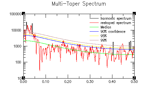
Figure 2. MTM spectrum for `soi'
(. X-axis units are cycles per month, and y axis is spectral density .
- Selecting the `Reconstruction...' button allows
the user to perform time reconstructions of any of the
signals identified as signficant in the spectrum analysis.
A menu contains an itemized list of the central frequencies
of narrowband signals with associated
statistical significanes for signals significant
at greater than the 90% level relative to
the specified null hypothesis (a maximum of the 40 most
significant signals are stored). The user can select
one or more of these signals for reconstruction, or a group of
them to be silmultaneously reconstructed and summed, by
clicking on the appropriate frequencies. The selected
signals will be highlighted in the list. To select a group
of signals, hold down the control key while selecting
each one. The group of selected signals should appear highlighted
The `display'button in the menu
will produce a plot of the reconstructed
signal along with the raw data, while the `save' button
will allow the user to save the reconstructed signal
as a file.
- Selecting the `Save' or `Save As...' buttons
allows the user to save the spectrum in a file.
There are four (4) menu items below the `MTM preferences'
heading which allow the user to change various settings
from their defaults:
Selecting the ``Null hypothesis'' menu item
will produce a list of possible choices which can be selected.
This includes several subgroups each from which one choice
is selected:
The first subgroup of options is:
red noise
locally white
white
The choice of ``red noise''assumes a noise background
that consists of a temporally integrated Gaussian white
noise or ``AR(1)'' noise process. This null hypothesis
is strongly motivated for dynamical reasons in the study
of geophysical phenomena, and represents the default option
of the Toolkit.
The choice of ``locally white noise'' assumes
a colored noise
process that varies slowly but arbitrarily with frequency.
This choice is recommended if there is a priori reason to believe
that the noise background has a complex structure.
The choice of ``white noise'' represents a good null
hypothesis if absolutely nothing is known a priori about the
physics or dynamics of the process producing the noise
background.
The second subgroup of options is:
robust
raw
The ``robust'' noise background choice
employs a robust estimator (median smooth) to find an optimal
background fit to the empirical spectrum for measuring the
signficance of narrowband signals.
This choice guards against the contamination of noise paramater
estimation by narrowband signal and significant trend contributions,
and represents the default option.
The ``raw'' option estimates noise parameters directly
from the unfiltered or ``raw'' time series. This option, albeit
more traditional, is
generally discouraged. It should be selected, however, if the user
is interested in signals whose significance is measured only by
the Thomson variance ratio test for periodicity,
without regard to their significance as measured
by their amplitude relative to the estimated noise
background.
The third subgroup of options represents a choice between
the two options:
log fit
linear fit
AND a choice of the item
median smoothing
The ``log fit'' employs a criterion which
minimizes the misfit of the robustly estimated background
with the log of the spectral density. This provides a better
conceptual fit to the spectrum when dynamic ranges are large,
and is the suggested choice. It is the default option.
The ``linear fit'' employs a criterion which
will weight the robust fit of the noise background by the
amplitude of the spectrum. This choice is recommended if
it is more important to fit the low-frequency, high-power
part of noise background.
The ``median smoothing'' option is
enforced for the ``robust'' noise
background estimation and is thereby a default.
The default is selection of a noise background based
on the fit to a median smooth of the raw spectrum
with a smoothing window of width f_smooth frequency
units that is the larger of either f_Nyquist/6
or the full spectral resolution bandwith 2 p f_Rayleigh.
This generally insures that the overall structure of
the spectrum over the full ``Nyquist'' interval is
recognized in the optimal background fit, while assuring
that the fit is resistant to the influence of narrowband features
in the spectrum. This value can be varied by the user within
the range 2 p f_Rayleigh to 0.25 f_N.
As with the choice of ``log fit'' and ``linear fit'',
any results which show great sensitivity to the
value of the median smoothing window f_smooth over that
range should be interpreted with some caution.
Selecting the ``Signal Assumptions'' menu item
will produce a list of (3) mutally exclusive choices which can be selected.
The choice ``either'' indicates that the spectrum should
for the vertical axis of the displayed spectra:
The choice ``either'' indicates that the spectrum should
be tested both for the presence of narrowband signals whose
significance is measured by their amplitude relative to the
estimated noise background, and for the presence of ``harmonic''
signals which are significant as measured by the Thomson
variance ratio test for periodic signals. This is the
default choice.
The choice ``narrowband'' will test the spectrum only
for the presence of narrowband signals, the former of the two
possible signal detection procedures described above.
The choice ``harmonic'' will test the spectrum only
for the presence of periodic signals, the latter of the two
possible signal detection procedures described above.
Selecting the ``Display'' menu item
provides a list of different conventions for displaying the
results of the spectral analysis procedure:
The first group represents two mutually-exclusive choices
for the vertical axis of the displayed spectra:
log scale
linear scale
The choice ``log scale''indicates that spectra
should be plotted by the
conventional log(spectral density) vs frequency dependence,
and is the default setting.
The choice ``linear scale'' conversely
plots results using a linear vertical axis vs. frequency.
This convention is more sensible for displaying the
results of the ``harmonic peak test'' (see below).
The second group represents the choice of spectral analyses
or diagnostics to be displayed:
reshaped vs. harmonic spectrum
raw spectrum
harmonic spectrum
reshaped spectrum
harmonic peak test
Note that the first 4 choices share common spectral
density units and can be selected silmultaneously, while
the 5th display item exhibits variance-ratio units
and cannot be displayed silmutaneously with the
other choices.
The choice ``reshaped vs. harmonic spectrum''
indicates the the estimated continuous MTM spectrum or ``reshaped spectrum''
(the spectrum with
estimated contributions of harmonic signals removed) should
be shown along with the harmonic component of the spectrum.
This is accomplished by showing the estimated continous spectrum
by a solid curve, along with a dashed curve that rises above
it to indicate the portion of the spectrum above the continuous
background associated with a period signal. The latter component
is shown as a narrow spike of breadth equal to the spectral
estimation bandwidth. Four additional smooth curves are shown,
in increasing vertical progression, for the median, 50%, 90%,
95%, and 99% significance levels relative to the estimated
noise background. This is the default display item.
The choice ``raw spectrum''indicates that
the raw MTM spectrum
should be displayed. As above, signficance curves are also
shown.
The choice ``harmonic spectrum'' indicates
that
the estimated harmonic or periodic component of the spectrum
should be displayed, as a function of frequency.
The choice ``reshaped spectrum'' indicates
that the reshaped spectrum (see above) should be shown on its own,
along with confidence intervals.
The choice ``harmonic peak test'' indicates
that the variance-ratio test for significance of harmonic
signal detection should be shown as a function of frequency.
Also shown are the median, 90,95,and 99% confidence levels
for significant detection of a periodic signal relative
to the assumption of locally-white noise.
Selecting the ``Spectrum'' menu item
provides a list of choices regarding the details of how
the MTM spectrum is estimated:
The first group represents a choice between two methods
of estimating the MTM spectrum:
adaptive
high-resolution
The choice ``adaptive'' indicates
that the adaptive MTM spectrum estimation procedure,
most resistant to broadband spectral leakage, is to
be employed. This is the default option.
The choice ``high-resolution'' indicates
that the high-resolution MTM spectrum, involving a simple
weighted average of the contributions of independent
eigenspectra, should be calculated.
The 2nd choice represents a choice between three
mutually exclusive
possible normalization conventions of the spectrum:
none
N
1/dt
The choice ``none'' indicates
a standard Fourier convention of a finite length
time series in which the spectrum scales with
the number of data points. This is the default
convention.
The choice ``N'' represents a
convention in which the spectrum is calculated
per unit time by dividing by the length of
the dataseries in in time units ``N''
(ie, a power spectral density).
The choice ``1/dt'' represents a
convention in which the spectrum is scaled by
the sampling interval (dt), approriate
for the spectral estimate of a presumed time-limited
signal such as a pulse.
The 3rd item regards the ``reshaping procedure'':
The user indicates whether or not the ``reshaping''
procedure (used to separate the continuous and harmonic
portions of the spectrum) should be performed. The procedure
is performed by default. The user also selects a treshold
for significance of harmonic peak detection (90%,95%,99%)
in the reshaping procedure. The default setting is 95%
significance. The user should be aware that chance
statistics should lead to a 5% rate of spurious harmonic
signal detection
at the 95% level, corresponding to roughly 2-3 false positives over the Nyquist
interval for a timeseries of length N=100 time
units, underscoring Thomson's (1982) general warning that one should
interpret with great caution significances of less than about
1-1/N.
Next Section |
Table of Contents |
References
URL: users.guide.mtm.html
This file last modified: May 5, 1997
THE SINGULAR-SPECTRUM-ANALYSIS TOOLKIT USER'S GUIDE
7. REFERENCES
Allen, M.R., 1992: Interaction between the Atmosphere and Oceans on
time scales of weeks to years. Ph.D. Thesis, St. Johns College,
Oxford. 203 pp.
Allen, M.R., Read, P.L., and Smith, L.A., 1992a:
Temperature time-series?, Nature, 355, 686.
Allen, M.R., Read, P.L., and Smith, L.A., 1992b: Temperature
oscillations, Nature, 359, 679.
Allen, M.R.,
Read, P.L., and Smith, L.A., 1992c: Investigating interdecadal
temperature variations using singular spectrum analysis,
Ann. Geophysicae, 10 suppl. 2, C253.
Allen, M.R.,
and Smith, L.A., 1994: Investigating the origins and signficance of
low-frequency modes of climate variability,
Geophys. Res. Letters, 21, 883-886.
Allen, M.R.,
and Smith, L.A., 1996:
Monte Carlo SSA: detecting oscillations
in the presence of coloured noise. J. Climate,
9, 3373.
Allen, M.R., and A.W. Robertson, 1996: Distinguishing modulated oscillations from coloured noise in multivariate datasets.
Climate Dynamics, 12 , 775-784.
Barnett,
T.N., Graham, N., Cane, M., Zebiak, S., Dolan, S., O'Brien, J., and
Legler, D., 1988: On the prediction of the El Niño of
1986-1987, Nature, 241, 192-196.
Bjerknes, J.,
1969: Atmospheric teleconnections from the Equatorial Pacific,
Mon. Wea. Rev., 97, 163-172.
Blackman, R.B., and
Tukey, J,W., 1958: The measurement of power spectra from the point of
view of communication engineering. Dover Publications, 190 pp.
Box, G.E.P., and Jenkins, G.M., 1976: Time series analysis:
forecasting and control. Holden-Day, Oakland, Cal., 575 pp.
Broomhead, D.S., and King, G., 1986: Extracting qualitative dynamics
from experimental data, Physica D, 20, 217-236.
Burg, J.P., 1978: A new technique for time series data, in Childers,
1978, IEEE Press.
Childers, D.G., ed., 1978: Modern Spectrum
Analysis. IEEE Press, 334 pp.
Colebrook, J.M., 1978: Continuous
plankton records - zooplankton and environment, northeast Atlantic and
North-Sea, 1948-1975, Oceanol. Acta, 1, 9-23.
Dettinger, M.D., and Ghil, M., 1992: Interannual and interdecadal
variability of surface-air temperatures in the United States,
Proc. 16th Annual NOAA Climate Diagnostics Workshop, Lake Arrowhead,
Cal., 209-214.
Elsner A.A., and Tsonis, J.B., 1991, Do bidecadal
oscillations exist in the global temperature record?, Nature,
353, 551-553.
Fraedrich, K., 1986: Estimating the
dimension of weather and climate attractors, J. Atm. Sci.,
43, 419-432.
Ghil, M., and Mo, K., 1991a:
Intraseasonal oscillations in the global atmosphere--Part I: Northern
Hemisphere and Tropics, J. Atm. Sciences, 48,
752-779.
Ghil, M., and Mo, K., 1991b: Intraseasonal oscillations
in the global atmosphere--Part I: Southern Hemisphere,
J. Atm. Sciences, 48, 780-790.
Ghil, M., and C. Taricco, 1997: Advanced Spectral Analysis Methods. In Past and Present Variability of the
Solar-Terrestrial System: Measurement, Data Analysis and Theoretical Models, G. Cini Castagnoli and A.
Provenzale (Eds.), Societa Italiana di Fisica, Bologna, & IOS Press, Amsterdam, pp. 137-159.
Ghil, M., and
Vautard, R., 1991: Interdecadal oscillations and the warming trend in
global temperature time series, Nature, 350,
324-327.
Ghil, M., and P. Yiou, 1996: Spectral Methods: What they can and cannot do
for climatic time series, Decadal Climate
Variability: Dynamics and Predictability, D. Anderson and J. Willebrand (Eds.), Elsevier, pp. 446-482.
Kay, S.M., 1988: Modern spectral estimation--Theory and
application. Prentice-Hall, 543 p.
Keppenne, C.L., and Ghil, M.,
1992: Adaptive spectral analysis and prediction of the Southern
Oscillation Index, J.Geophys. Res., 97,
20449-20554.
Keppenne, C.L., and Ghil, M., 1993: Adaptive
filtering and prediction of noisy multivariate signals: an application
to atmospheric angular momentum, Intl. J. Bifurcation and Chaos, in
press.
Kimoto, M.,Mo, K.-C., and Ghil, M, 1991: Spatial structure
of the extratropical 40-day oscillation, Proc. Eighth Conf. on
Atmos. and Oceanic Waves and Stability, Amer. Meteorol. Soc.,
115-116.
Koch, D.M., and Mann, M,E, 1996: Spatial and temporal variability of
7Be surface concentrations, Tellus, 48B, 387-398.
Kuo, C., Lindberg, C. and Thomson, D.J., 1990: Coherence established
between atmospheric carbon dioxide and global temperature, Nature,
343, 709-713.
Lall, U. and Mann, M, 1995: The Great Salt Lake: A barometer of
low-frequency climatic variability, Water Resources Research,
31, 2503-2515.
Manly, B.F.J., 1986: Multivariate statistical
methods. Chapman and Hall, 159 pp.
Mann, M.E. and Park, J, 1993: Spatial correlations of interdecadal variation
in global surface temperatures, Geophys. Res. Lett., 20,
1055-1058.
Mann, M.E. and Park, J, 1994: Global scale modes of surface temperature variability
on interannual to century time scales, J. Geophys. Res., 99,
25819-25833.
Mann, M.E., Lall, U., and Saltzman,B, 1995: Decadal-to-century scale
climate variability: insights into the rise and fall of the Great
Salt Lake, J. Geophys. Res., 22, 937-940.
Mann, M.E., Park, J. and Bradley, R.S., 1995: Global interdecadal
and century-scale climate oscillations during the past five centuries,
Nature, 378, 266-270.
Mann, M.E. and Park, J, 1996: Greenhouse warming and changes in the
seasonal cycle of temperature: model versus observations, Geophys. Res.
Lett., 23, 1111-1114, 1996.
Mann, M.E. and J. Park, 1996: Joint spatiotemporal modes of
surface temperature and sea level pressure variability in
the northern hemisphere during the last century, J. Climate,
9,
2137-2162.
Mann, M.E. and Lees, J.M., 1996: Robust estimation of background
noise and signal detection in climatic time series,
Clim. Change., 33, 409-445.
Park, J., 1992: Envelope estimation for quasi-periodic geophysical
signals in noise: A multitaper approach, in Statistics in
the Environmental and Earth Sciences, edited by A.T.
Walden and P. Guttorp, 189-219, Edward Arnold, London.
Park, J. and Maasch, K.A., 1993: Plio-pleistocene time evolution of
the 100-kyr cycle in marine paleoclimate records, J. Geophys. Res.,
98, 447-461.
Park, J., Lindberg, C.R., and F.L. Vernon III, 1987: Multitaper
spectral analysis of high-frequency seismograms, J. Geophys. Res.
, 92, 12675-12684.
Marple, S.L., 1987: Digital
spectral analysis, with applications. Prentice-Hall, 492 pp.
Marsaglia, Zaman, and Tsang, 1990: Toward a universal random number
generator, Stats & Prob Letters, 8, 35-39.
North, G.R., Bell, T.L., Cahalan, R.F., and Moeng, F.J., 1982:
Sampling errors in the estimation of empirical orthogonal functions,
Mon. Wea. Rev., 110, 699-706.
Palus, M., and
Dvorak, I., 1992: Singular-value decomposition in attractor
reconstruction: Pitfalls and precautions, Physica D,
55, 221-234.
Penland, C., Ghil, M., and
Weickmann, K., 1991: Adaptive filtering and maximum entropy spectra
with application to changes in atmospheric angular momentum:
J. Geophys. Res., 96, 22659-22671.
Penland, C.,
and Magorian, T., 1993: Prediction of Niño 3 sea surface
temperatures using linear inverse modeling, J. Clim.,
6, 1067-1076.
Percival, D.B., and Walden, A.T.,
1993: Spectral analysis for physical applications--Multitaper and
conventional univariate techniques. Cambridge University, 580 p.
Press, W.H., Flannery, B.P., Teukolsky, S.A., and Vetterling, W.T.,
1989: Numerical recipes--The art of scientific computing (FORTRAN
version). Cambridge University Press, 702 p.
Rajagopalan, B., Mann, M.E., and Lall, U., 1996: A multivariate frequency-domain
method for long-range climatic forecasting, Weather and Forecasting, submitted.
Rasmusson, E.M.,
Wang, X., and Ropelewski, C, 1990: The biennial component of ENSO
variability, J. Marine Sys., 1, 71-96.
Sauer, T.,
1993: Time series prediction by using delay coordinate embedding, in
Weigend, A.S., and Gershenfeld, N.A., (eds.), Time Series Prediction:
Forecasting the Future and Understanding the Past, Santa Fe Institute
Studies in the Sciences of Complexity, Proceedings,
15, Addison-Wesley, p. 175-195.
Thomson, D.J., 1982: Spectrum estimation and harmonic
analysis, Proc. IEEE, 70, 1055-1096.
Thomson,
D.J., 1990a: Time series analysis of Holocene climate data,
Phil. Trans. R. Soc. Lond A, 330,
601-616.
Thomson, D.J., 1990b: Quadratic-inverse spectrum
estimates: applications to paleoclimatology,
Phil. Trans. R. Soc. London A, 332, 593-597.
Thomson, D.J., and Chave, A.D., 1990: Jackknifed error estimates for
spectra, coherences, and transfer functions, Chapter 2 in Haykin,
S. (ed.), Advances in Spectrum Analysis. Prentice-Hall.
Tsonis,
A.A., and Elsner, J.B., 1992: Oscillating global temperature, Nature,
356, 751.
Unal, Y., and
Ghil, M., 1992: Interannual oscillations and sea level rise: Proc,
16th Annual NOAA Climate Diagnostics Workshop, Lake Arrowhead, Cal.,
237-240.
Vautard, R., and Ghil, M., 1989:
Singular spectrum analysis in nonlinear dynamics, with applications to
paleoclimatic time series, Physica D, 35,
395-424.
Vautard, R., Yiou, P., and Ghil, M., 1992:
Singular-spectrum analysis: A toolkit for short, noisy chaotic
signals, Physica D, 58, 95-126.
Yiou, P.,
Genthon, C., Ghil, M., Jouzel, J., LeTreut, H., Barnola, J.M., Lorius,
C., and Korotkevitch, Y.N., 1991, High-frequency paleovariability in
climate and CO2 levels from Vostok ice-core records: J. Geophys. Res.,
96, 20365-20378.
Table of Contents
URL: users.guide.references.html
This file last modified: January 18, 2000
THE SINGULAR-SPECTRUM-ANALYSIS TOOLKIT USER'S GUIDE
2. TOOLKIT SPECIFICATIONS AND TECHNICAL ACKNOWLEDGMENTS
The SSA Toolkit is provided with a convenient X-windows graphical users'
interface (GUI) that was developed using the wish windowing shell, Tk X-window
toolkit, and Tcl command language (Ousterhout, 1994). Together, wish, Tk,
and Tcl provide a shell that allows the Toolkit components to be launched
effortlessly from X-window environments. Several Tk extensions, written
by Jim Davidson and Terry Figel at the Center for Remote Sensing and Environmental
Optics, UC Santa Barbara, were incorporated to make the Toolkit easier
to use.
Currently, the main Toolkit components are contained infiver numerical
programs:
- ssa--Performs SSA decomposition of an input time series as well
as reconstructions of selected components
- mcssa--Perform Monte-Carlo tests of SSA against noise.
- spectrum--Computes Blackman-Tukey correlogram and MEM estimates
of power spectra.
- mtm--Computes MTM estimates of spectral amplitudes.
- carlo--Generates Monte Carlo realizations of white or red noise
that resemble a given time series or partial SSA reconstruction of that
series; computes error bars for the SSA eigenvalues based on those realizations.
Each program is functional in a stand-alone mode, i.e., without the
GUI, on any computer with a standard FORTRAN 77 compiler. These programs
are structured as Unix commands and can be invoked in batch mode by shell
scripts. HTML pages are provided with the Toolkit distribution for each
of these programs to explain their usage. Much guidance for the development
of these programs was obtained from earlier SSA and MEM codes written and
provided by Cecile Penland of the University of Colorado, Boulder. Source
code for some of the eigenanalysis routines was from the SLATEC library,
a public domain package provided by the National Energy Software Center
in Argonne, Illinois.
The GUI displays time series, eigenvalues (variance) spectra, and power
spectra to windows. It can also--through the graphics packages used to
display Toolkit graphs-- copy these to Postscript files for printing. The
visualization requirements to generate and display these graphs are relatively
simple, and the Toolkit has been designed so that different graphics packages
can be accommodated. Currently the Toolkit supports visualization using
IDL (a proprietary package by Research Systems, Inc.) or the public-domain
ACE/gr and gnuplot plotting programs.
The SSA Toolkit is configured for analysis of a univariate time series,
and thus expects a series {x(i),i=1,...,N} as input. Practical size
constraints on Toolkit analyses arise from the width of the SSA or correlogram
windows or the number of Monte Carlo realizations used to form error bars,
rather than the length of the time series. Most matrices to be diagonalized
in the various procedures have dimensions equal to these window lengths,
that determine the computational times and memory requirements. As a practical
matter, window widths should be less than about 300-500, but such limits
depend on the size and speed of the computational device--workstation or
mainframe--used. An exception to this "rule" is the Burg estimate
of autocorrelation structures for SSA and AR coefficients for MEM; for
long series (order of 5,000 samples), this algorithm can be time consuming
also.
Time series can be input in the following formats:
- ASCII strings of x(i), one observation per line, and
- ASCII strings of {t, x(t)}, one observation time and observation
per line.
As indicated, Toolkit outputs take the form of postscript graphics,
ASCII tables and logs, and ASCII vectors, series and power spectra.
Questions, suggestions, and bug reports should be sent to ssahelp@atmos.ucla.edu
.
The Toolkit is an evolving package and we encourage feedback on its
form and future. We will make every effort to help you get the most from
the Toolkit.
5. SUMMARY
The Singular-Spectrum Analysis (SSA) Toolkit was designed to make certain
modern forms of time-series spectrum analysis more accessible to Earth
scientists. These spectral tools--especially SSA--have not been available
in previous statistical packages. We hope that enhanced accessibility will
lead to frequent use in varied applications. In a matter of minutes, [i]
any univariate time series can be decomposed to isolate periodic and trend
components, [ii] its power spectrum evaluated by modern methods including
Multi-Taper Method and Maximum-Entropy Method, both before and after filtering
with the SSA procedures, and [iii] selected trends, oscillations, and other
structured components of the signal can be put out (or further analyzed)
for other uses. The analytical power and user-friendliness of the Toolkit
are a promising combination that should make analysis of large geophysical
datasets much more tractable.
The current Toolkit presents one "complete basis" for spectral
analysis of univariate time series in the sense that all the tools for
a complete analysis using SSA are provided; however, it has been designed
specifically with expansion in mind. There are literally dozens of other
modern spectral-analysis methods available, and the potential for development
of additional methods is far from exhausted. Further elaboration of the
confidence tests for SSA (including that of Allen and Smith [1994]) and
Multi-Taper Method is also under development and may appear in future versions
of the Toolkit. Similarly, a number of alternatives to univariate SSA are
available. SSA has recently been extended to a multi-channel form that
has allowed powerful analyses of time-varying climatic fields (e.g., Kimoto
et al., 1991; Keppenne and Ghil, 1993). Used together with spatial EOF
analyses to reduce spatial dimensionality, multi-channel SSA (M-SSA) can
provide remarkable efficiency in analysis of massive climatic datasets.
Consequently, addition of M-SSA capabilities to the SSA Toolkit is a near-term
priority. Room also exists in the Toolkit for addition of such procedures
as principal-oscillation-pattern analyses (e.g., Penland and Magorian,
1993) and canonical-correlation analyses (e.g., Barnett et al. 1988). Although
the Toolkit is not intended to be a comprehensive time-series analysis
package, additions and contributions are welcomed and will be incorporated
when possible.
6. ADDITIONAL ACKNOWLEDGMENTS
The development and application of SSA to geophysical time series was
carried out by the present authors in collaboration with N. Jiang, C.L.
Keppenne, K.-C. Mo, J.D. Neelin, M.C. Penland, G. Plaut, A.W. Robertson,
Y. Sezginer, S. Speich, and R. Vautard. Comments by these collaborators
and numerous other colleagues on test versions of the Toolkit are gratefully
acknowledged. The Toolkit was developed mostly on equipment and with support
provided by Digital Equipment Corporation to the University of California,
Los Angeles, Department of Atmospheric Sciences, as part of the Sequoia
2000 project. Research for the development of the methods and their applications
to climatic time series was supported by NSF Grant ATM93-13217, NOAA Grant
NA36G90245, and an NSF Special Creativity Award to M. Ghil. Use of trade
names in this article is for identification purposes only and does not
constitute endorsement by the U.S. Geological Survey.
References
Table of Contents
URL: users.guide.summary.html
This file last modified: May 12, 1997
����users.guide.references.html�������������������������������������������������������������������������100644 � 1333 � 1 � 24520 7072473745 15526� 0����������������������������������������������������������������������������������������������������ustar �tcdatmos������������������������other������������������������������������������������������������������������������������������������������������������������������������������������������������������������������������������������������������������