
 |
 |
 |
 |
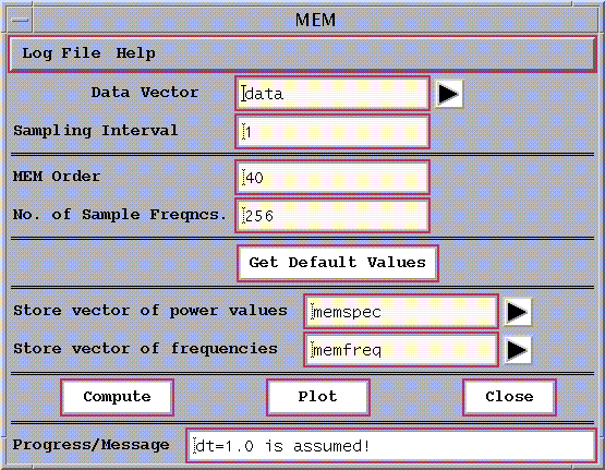
Figure 3a: MEM window.
Here the user needs to specify the data vector to be analyzed, the sampling interval, the MEM Order , along with the number of sample frequencies to be plotted and the names of the output vectors. Once the data vector has been chosen (here 'data' by default) the Get Default Values button allows a default choice of the remaining parameters, which are shown in Fig.3a for our SOI time series. The number of sample frequencies is actually forced by the Toolkit to be equal to a closest value of a power of 2, and the power densities at this number of evenly-spaced frequencies between 0 and 0.5/dt are estimated. If sampling interval is not specified, it is set to unity, i.e. dt=1.
The order of the MEM is the number of AR components (or poles) to be included in the analysis, and determines the spectral resolution. The number of spurious peaks usually grows with the MEM order. Note that the spectral resolution is independent of the number of sample frequencies. Robustness of results to MEM Order is the simplest test of their validity.
Running the tool using the Compute button at the bottom writes results to the specified internal vector names, which are given here by default. To save the results to a file, one would go to the File/Data pull-down menu on the main Spectra panel.
Finally, the resulting spectrum can be plotted using the Plot button. As in all the tools, the frequencies generated have units of cycles per sampling-interval. The range plotted is from 0 to 0.5 cycles per sampling interval.
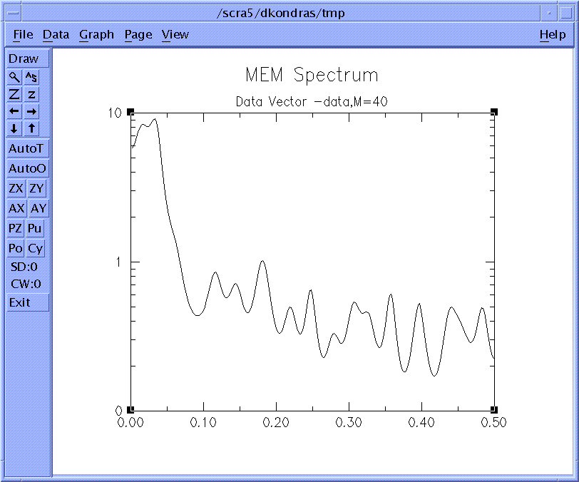
Figure 3b: MEM Spectrum.
We can now plot the BT Correlogram and MEM spectral estimates on one plot using MultiVector function of Plot pull down menu in the main window.
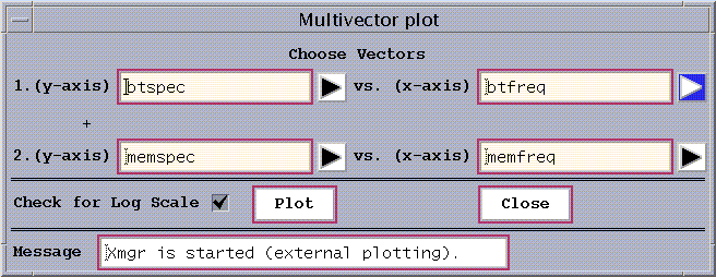
Figure 3c: MultiVector Plot Window
We specify the vectors with the results of corresponding spectral estimates, and click Plot button to obtain the following plot:

Figure 3d: Spectral Cross-Examination
We can use SSA (see below) to better separate the El Niño signal from the noise, reconstruct contributions to the original series from the leading oscillatory components (T-EOFS), and then pass resulting RC series through MEM analysis. The following result is obtained:
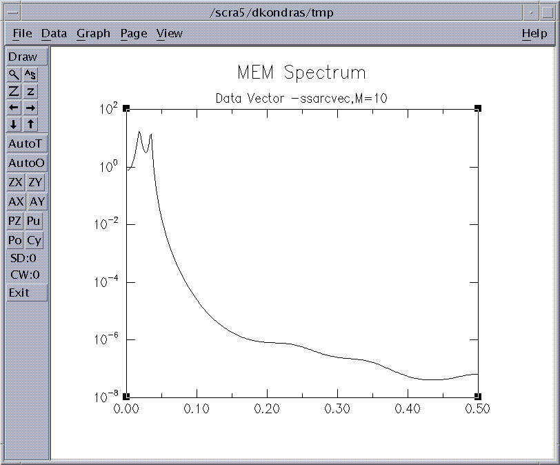
Figure 3e: MEM Spectrum of RCs series.
The regression order M=10 for MEM spectrum of the SSA RC series suffices to separate clearly two distinct peaks at 0.018 and 0.034 cycles/month, which correspond to the QQ and QB components of El Niño. There are now no spurious peaks and the signal-to-noise ratio considerably increased.
|
|
|
|
|